
How to build a Learning Management System (LMS) in React & Golang in minutes
How to build a Learning Management System (LMS) in React & Golang in minutes By James Virgo A custom Learning Management System (LMS) enables you

24th April 2025
Over the past 6 months, I’ve consulted for many startups, SMEs & enterprises on how to design paywalls that increase the number of paid subscribers to your app.
What I have learnt is that paywalls continually evolve over time. Therefore, you need to design a paywall strategy that takes account of business objectives, the current stage of your app development lifecycle & the resources that you have at your disposal.
In this article, we are going to look at the correct way to build & optimise a paywall for your app taking into account these different business, product & resource variables.
We will cover:
Note: You don’t need to do everything in this article in one shot & you should not try & do everything in this article in one shot. In fact, when you design your paywall strategy, you should keep your paywall as simple as possible until you’re ready to layer in more complexity. As a general rule: there is no sense in being prematurely complex with your paywall design & implementation.
In website & app development, a paywall is a digital payment barrier that app builders can set up for select online offers. App users can access content or features behind the paywall after paying a fee or by completing a subscription.
For example, the dating app Tinder has a lot of paywalls. With Tinder, the app’s users will look at the profile of a person. Based on the information in the profile, the user will swipe the profile left if they want to go on a date & right if they do not want to go on a date.
Tinder uses paywalls throughout their app, blocking off different features such as limiting the number of swipes that free users can do & offering different memberships with different features.

Companies invest a lot of money testing out different paywall strategies. In order to work out what is the best paywall strategy for your app, you first need to understand the different types of paywall.
There are several different types of paywalls. The key types of paywall are hard paywall, soft paywall, metered paywall, dynamic paywall, adblocks & freewalls. App developers will often combine different types of paywalls into their app in order to give customers a variety of different digital subscription offers.
A hard paywall prohibits visitors from using any features of your app without a subscription. In app development a hard paywall only works to convert people who have an extremely high demand for a software solution Those that do not have such a high demand will likely go elsewhere to find the content or features that they need.
A good example of an app that has a hard paywall is Netflix. This app requires you to sign up for a paid account in order to access their library of video content. The paywall works in three steps.

By breaking the paywall into three parts, this allows Netflix to collect up information on prospects, before scaring them away with actually asking for a payment.
This strategy has worked extremely well for Netflix who now have over 214 million subscribers.
From my own experience, I have found that a hard paywall can act as a great filter mechanism for early stage startups. This is because hard paywalls filter out users who do not have a super high demand for a software solution. This can keep the cost of running a new app low in the early days & allows startups the chance to work with a smaller, early cohort of users that are really in need of the software solution. Users that have a high demand are generally better customers, they will give valuable feedback & are willing to go through teething issues in order to get a result.
Hard paywalls can also work where an app already dominates the market, target niche &/or provide added value to their content. This is more common in enterprise sales models, but it can also be seen in B2C products such as the VOD (Video On Demand) services (e.g. Netflix, Disney Plus, AppleTV+ etc.), eLearning systems (e.g. Masterclass, Rosetta Stone), fitness apps (e.g. bim, Wefast etc.) & many more.
In contrast to hard paywalls, soft paywalls allow users to access some of the content or features based on criteria that is decided by the app creator. The approach allows app users to experience the value of the app’s content or features before purchasing a subscription. The most common implementations of a soft paywall are metered & freemium paywalls.
“Metered” paywalls allow users to access a set amount of content or system resources before restricting access. For instance, an eLearning app may allow users to consume a certain amount of content for free as long as the user has not surpassed the set limit. After the user has surpassed the set limit, a paywall will popup & ask the user to subscribe to the app in order to continue viewing the content.
The metered model is designed to allow apps to retain usage from light users, which allows the app to keep a high number of active users that they can look to upsell onto paid subscriptions once the user has got value out of the app. They are also far less disruptive than hard paywalls.
Metered paywalls work great for apps that display content such as eLearning apps that display video content, publishing platforms such as apps that display news or interesting articles, apps that give users the options to run searches for information & so on.
Notwithstanding all of the benefits, a major downside of a soft, metered paywall is that they are more “leaky” than hard paywalls. This means that they allow for certain technical conditions where users are able to access content beyond the metered quota. For example, a user might delete their cookies or visit your app in incognito mode.
To see how effective a soft paywall is, app creators who use metered paywalls should track the “stop rate”. The stop rate is the percentage of total visitors who eventually hit the subscription paywall after exhausting their weekly or monthly limit of free app usage.
A “softer” paywall strategy allows users to access selected content &/or app features for free, while keeping premium content behind a paywall. Similar to the metered approach, a freemium model allows users to become familiar with what the platform does before committing to a purchase. This approach can increase user acquisition, improve customer retention rates, lower refund rates & so on. However, it can also have a negative impact on your app development strategy if you don’t already know what features your users are willing to pay for.
Some examples of companies that run great freemium models are set out in the table below.
| Company | Free Features | Paid Features |
|---|---|---|
| Canva | Access to many design templates & elements. | Access to premium templates, resize designs, upload custom fonts, and access pro design elements. |
| Create a profile, connect with other professionals & search for jobs | Send messages to people outside your network, access premium insights, see who has viewed your profile, access online learning courses. | |
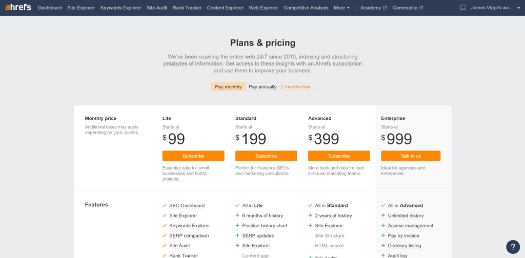
| Ahref | Get access to free analytics about your website & see issues with your website. | Get access to advanced website analytics on yourself & your competitors. |
| Webflow | Build & launch two basic websites. | Pay to build more websites & ecommerce stores. Pay for more resources as your website scales. |
Free trial paywalls are the most commonly used paywall in app development. They allow users to see the value of the services for free before making a buying decision. Free trial paywalls also provide a great hook to capture leads for your app, engage those leads & learn which features your leads are willing to pay for. You can then convert these leads over time into paying customers.
A key decision that you need to make is how long do you want your free trial to be. 30 days is a good starting point however, as your apps usage grows & other business drivers come into play, you can try shortening your free trial to 14 days. This will have the impact of shortening the time it takes for users to subscribe.
Rather than just abruptly shutting down the free trial, you can allow the user the option to extend their free trial by 5 days with the input of a credit card. This can help soften the blow for users hitting the paywall, whilst simultaneously validating the trial user’s level of interest & moving them both physically & mentally closer to payment.
A dynamic paywall breaks away from the traditional static paywalls that we have discussed so far. Instead, the dynamic paywall collects up user data so as to personalize the paywall experience for each user of your app. The goal of this tailored approach is to make offers that are more in line with each user’s demand for the software solution, thereby increasing the percentage of users that convert into subscribed customers. For instance, data has proven that users who visit your app on a mobile device have different buying behaviors to users who visit on a desktop & app users who sign into your app multiple times a week have a greater propensity to buy than someone who just signs into your app one time in the first 14 days.
More recently, dynamic paywalls solutions such as Zuora & Vidora have integrated AI into their paywall experience. These solutions enable app creators to build high converting subscription funnels that constantly analyze, learn & adapt themselves to different user behavior. With this information, AI is able to determine when best to show a paywall, the price that is most likely to convert a particular user & possible discount offers that can be made.
As with the freemium paywalls, dynamic paywalls are harder & more complex to implement compared to hard, soft metered & free trial paywalls. This means that dynamic paywalls are better suited for more mature apps. At the early stage of your app development, getting your app in front of your users is the most important thing to do. Once you’re ready to explore dynamic paywall solutions, there are a number of good third party solutions that you can investigate such as Zuora.
One way that app creators will seek to monetize their software is by implementing an in app ad strategy. Below is an example of an app built on Dittofi that does just this. In this app, you can see that the app creator has sold ad space to businesses that want to advertise their services directly inside of the app.
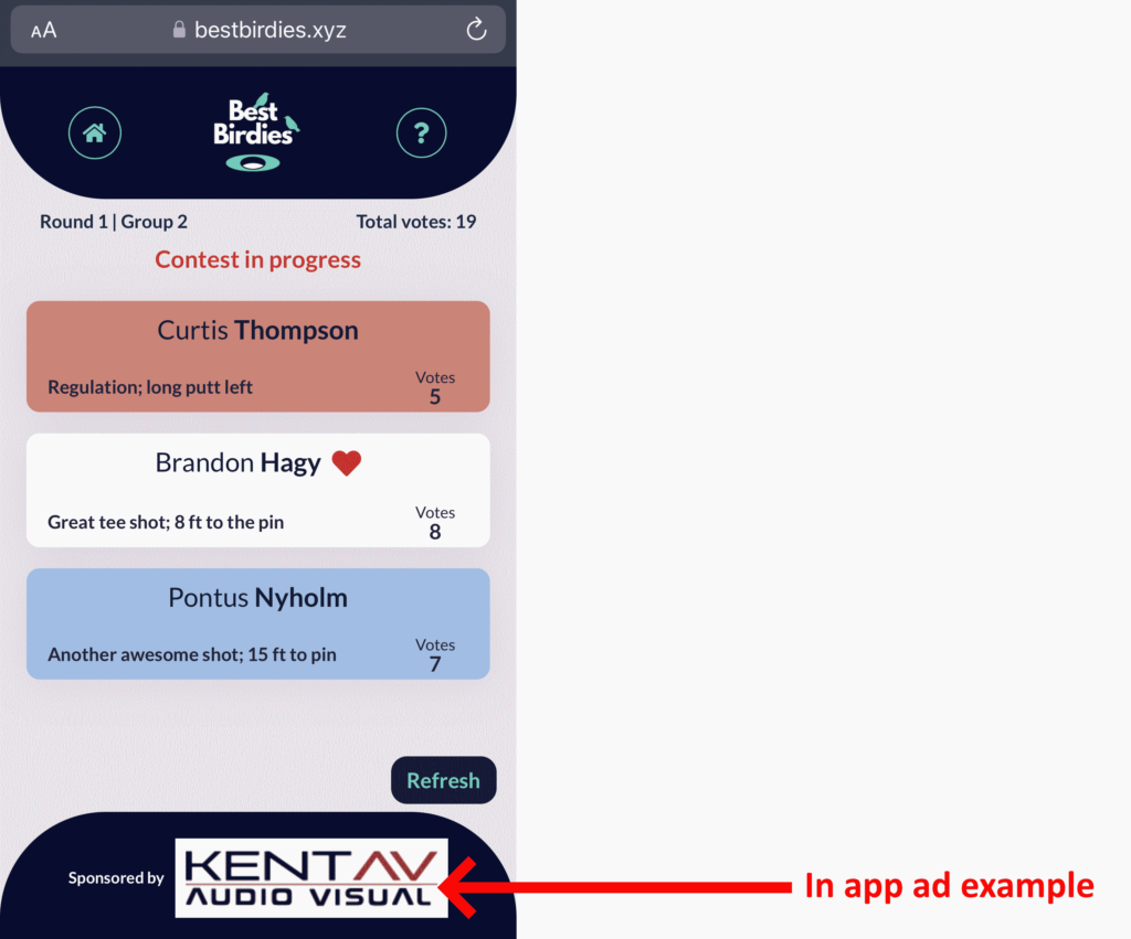
The challenge with in app ads is that web app users will often run their browsers with adblock technology enabled. A study done by BlockThrough revealed that app creators have an adoblock rate of 10% – 40%. Not having a strategy in place to engage this audience means leaving revenue on the table.
To get around this, app developers can set up an “adblock wall”. The intention of an adblock wall is to educate users about the business need that the app has for advertising revenue. The goal is to convince app users to whitelist the web app so that the app creator can continue to serve advertising & generate revenue.
Although there are some exceptions, most adblock walls function as hard paywalls for adblock users, as shown below.
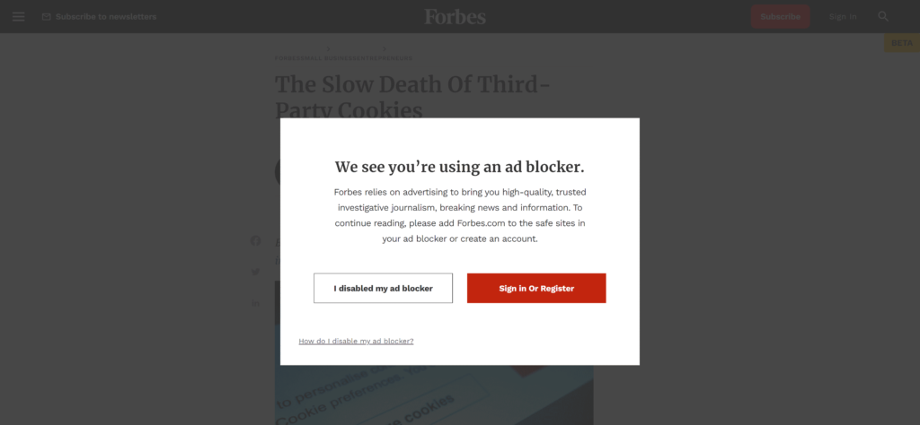
Since adbock walls function as hard paywalls they suffer from a high rate of app abandonment. Adblock walls also tend to be very ineffective when set up as a soft paywall. This is because it’s usually easy for users to dismiss the notice instead of complying with the request to whitelist.
A freewall is just a screen where users are asked to sign up for “free” (usually by handing over data such as an email address) in order to access content or experiences.
Conclusion:-
The choice of which paywall method to use for your app depends on(1) The stage of your app development lifecycle &
(2) what the type of app you have.
For example: Are you pre-product & if so is a hard paywall with a credit card free trial & a solid landing page enough for you? Do you already know what features your users value & can you expose these features on a free trial? Are you a mature product that can offer a dynamic paywall, a freemium based model or a combination of both?
Action:-
Before reading on. Take a moment to assess where you are in your app development & what is the most appropriate paywall strategy for your app.
Expert Tip:-
If you’re developing an app for the first time, we recommend something like the following approach.Develop a freemium model. Integrate a third party dynamic paywall technology. This strategy seeks to balance ease of set up, with a continual evolution of your paywall strategy.
- Start with a credit card only 30 day free trial - this will allow you to filter out the users that have the highest demand for your product, allow you to work with a smaller cohort of core users who will quickly tell you where they find value in your platform.
- Once you’ve got some satisfied customers, move to a 30 day free trial & see if your users are still active after 30 days.
- If your users live in your system for more than 30 days, try shortenning your free trial to 14 days, with an option to extend the free trial for 5 days by adding a credit card.
Striking a balance between business goals (to drive conversion) & user goals is often elusive & difficult. In this section, we will take a look at the top things to consider when designing a paywall experience that converts users.
While reading this section, bear in mind that:
As with any successful marriage proposal, where you ask, when you ask & how you ask matters.
There are five key things to think about when designing a paywall experience. We will look at:
In this section, we take a brief look at each of these points.
Paywall placement refers to the location within the app where a paywall will be shown. Where you choose to place your paywall should correlate to the stage that your user is in their buyer’s journey. For example, there may be different paywalls that are placed for new users, existing users, users about to cancel & so on.
A paywall placement strategy focuses on choosing the right interaction points to display the right paywalls to the right users in order to maximize user app subscriptions. In addition, showing the user that they will have to pay for the app is really important. This is because it can help psychologically prepare the user that they expect to pay for the app.
The winning combination for paywall placement tends to be to display the paywall:
Expert Tip:-
- App creators should monitor the percentage of users who actually see the paywall. This is known as the “Stop Rate”.
- Paywalls displayed prior to onboarding should include a video or some visual of the product so that users can get a sense of what they are about to purchase.
As we discussed in the previous section, content or features that your users find valuable enough to pay for can be put behind a paywall. However, generally users need to experience these features prior to paying for them.
With this in mind, ask yourself the question, which features in your app have self-evident value & how you can reveal these features prior to displaying a paywall. Then, if a user chooses to dismiss the paywall, what features can the user continue to use without taking a subscription.
Choosing when & how to block off valuable features depends on the stage of app development & what your overall product & business strategy is. I’ve developed several applications where we chose to paywall everything at first. This acted as a filter to find only those people who are willing to pay for the worst version of the app because they had the biggest problem to solve. Similarly, I’ve worked for companies that have a mission to always provide one part of the app entirely for free. In this case, we implemented a freemium approach that focused on providing different levels of value for free & paid tiers.
The third thing to test on your paywall is pricing.
When pricing your app, the ideal situation is that you show every single user a price that matches their demand. For example, suppose that you have an app that you distribute to two different countries. One is a developing country where wages are significantly lower & less predictable than a developed country. Users in the developing country will find less demand for your product vs other essential things such as food. Therefore, they are less likely to buy your app at the price set.
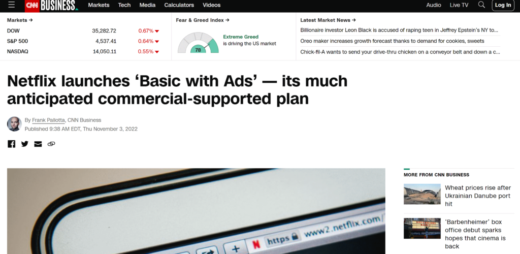
A company that really understands this is Netflix who in 2022 introduced a lower pricing tier for more price conscious consumers who don’t mind having ads flash up between the movies on their platform.
Lower demand can also be determined by the time it takes to subscribe. A user that signs up & then subscribes to your app immediately has a higher demand for your product than one who has not subscribed for 6 months after signing up. Using these indicators, you can develop pricing rules for different user types. For instance, if a user doesn’t sign up for 3 months, maybe you need to drop the price of your app with a one time offer for 6 months free & test if the user will take this offer up or not.
There are many indicators of app demand that you can consider such as location, time to subscription, session length & depth, average screens per visit & so on. The key however is to (A) not over engineer the process prematurely & (B) test different prices on different user scenarios. You will continually evolve your pricing over time, so best to start simple & then layer in the complexity when you’re ready.
The dating app Tinder is a great example of how pricing has evolved over time. When tinder started, the app was entirely free for all users. It then evolved to limit the number of swipes that you could do on a free tier subscription. However, since the early days, Tinder has evolved to have three subscription offerings that are a gold offering, a platinum offering & a platinum plus offering. Tinder also has in-app consumables for profile boosts & super likes. There is also the option to get a subscription for the boosts.
This example really illustrates that although your app’s pricing will & should start simple. As you learn more about your customers, you will add more & more advanced pricing options that are more tailored towards specific user types.
How you visually display your paywall will impact the number of users who sign up for your app. There are three patterns that are most often used that can help display paywalls. Not all of these patterns will be applicable within your app, so use those that make sense for your specific use case.
Pattern 1: In app notification
This pattern is not really a paywall but rather a very unobtrusive but visible notification that users can easily bypass to continue with their work. An example of how the app Airtable does this is shown below.

This way of displaying the option to pay helps get users psychologically ready to pay for access to your app.
Pattern 2: Modal overlay
The modal overlay enables users to see the resource they’re trying to access, but a dark overlay is placed on top if it. The paywall appears in a modal window on top of the content. The result looks like this:
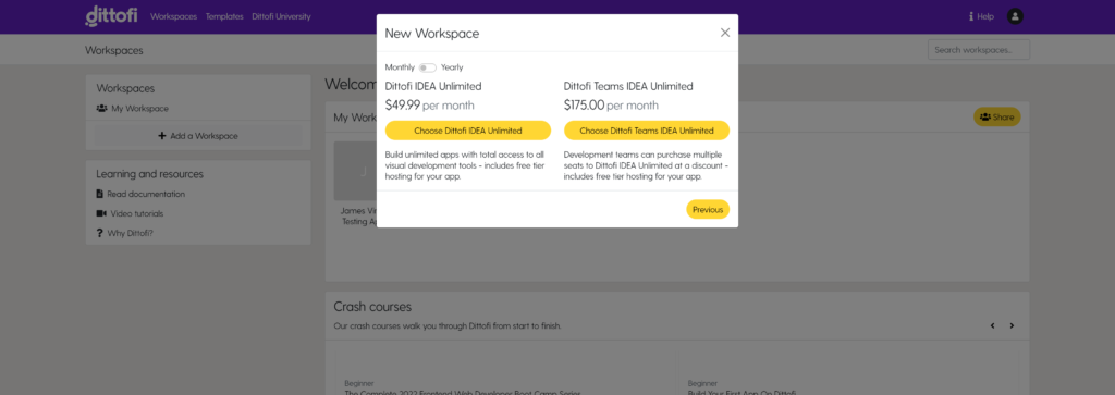
With this display style, users still get to see a little bit of the underlying content & they get a consistent experience, since they never leave your app.
As discussed earlier in this article, you should decide what options you want to make available for users to continue to work without making a payment to go through this paywall. Your decision of what to include & what not to include can & should evolve over time.
Pattern 3: Landing page
An alternative to the modal overlay is to redirect users to a landing page that displays all of offers for your app. This landing page can be embedded inside of your app (as shown below) or it can be on an entirely different page.
As with the modal popup, a landing page in app will give the users a consistent experience because they do not leave your app.
When writing the text that you will display on your paywall it’s good to remember one key rule. That is:
The highest performing copy is when you tell the user exactly what you want them to do. For example, you might write: click the orange button below to start your free trial.
Breaking down the text that is required, most paywalls include three key pieces of information:
Paywalls have a generalised headline that is designed to motivate the user to take action. For example, you will see headlines like “Go pro”, “Unlock total access” & “Get premium features”.
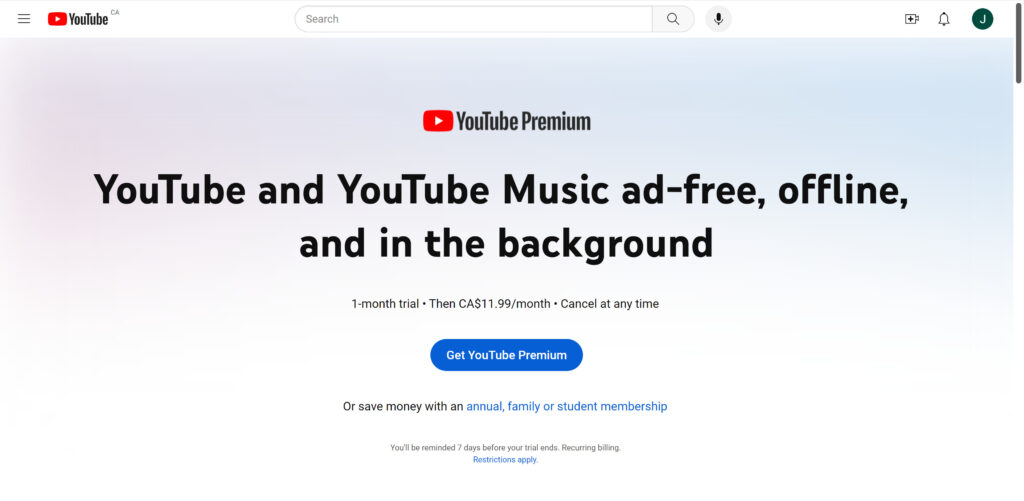
The more optimized paywalls use headlines that succinctly summarize how premium users get more value from the app. For instance, YouTube Premium has a simple paywall that states that users on a premium subscription will be able to watch videos ad-free, offline & in the background.
After the headline & subheading, a lot of apps choose to add a short blurb that highlights the premium version’s most valuable & popular features.
Lastly, almost all apps will show a list of features & benefits that you get by taking one of their subscriptions. As always, there is no one correct way to add the list of benefits & features.
Expert tip:-
When writing copy for your apps paywalls, it is best to run A/B tests. I have found that working with freelancers or getting input from my team can help come up with many ideas for good copy.
You can also ask your users for input on what they value most about your app. From my experience, your app's users have an ability to very succinctly describe exactly what they enjoy about your app.
Remember: writing copy that leads to user action is a skill.


How to build a Learning Management System (LMS) in React & Golang in minutes
How to build a Learning Management System (LMS) in React & Golang in minutes By James Virgo A custom Learning Management System (LMS) enables you

Why you should use Google Go (2025)
Why you should use Google Go (2023) By James Virgo Google Go has become the go to app development language for startups, SMEs & enterprises

How to design a two-sided marketplace transaction flow
Learn – Dittofi News How to design a two-sided marketplace transaction flow: A Step-by-Step Guide (2025) Etsy has transformed the way people buy and sell
⸺ Receive the latest news
Get notified about new articles and events